Alright fellow tape travellers, let’s rewind the clock, but maybe not quite as far back as the setting of tonight’s feature. We’re sliding a tape into the VCR, the distinctive clunk echoing in the den. This isn't just any sequel; it's the follow-up to one of the most iconic nostalgia trips ever committed to celluloid. But popping in "More American Graffiti" (1979) wasn't quite like revisiting Mel's Drive-In. It was… different. Braver, maybe? Messier, definitely. And certainly a fascinating creature from the tail end of the 70s, trying to capture lightning in a bottle a second time.
### Beyond the Boulevard
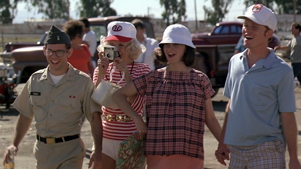
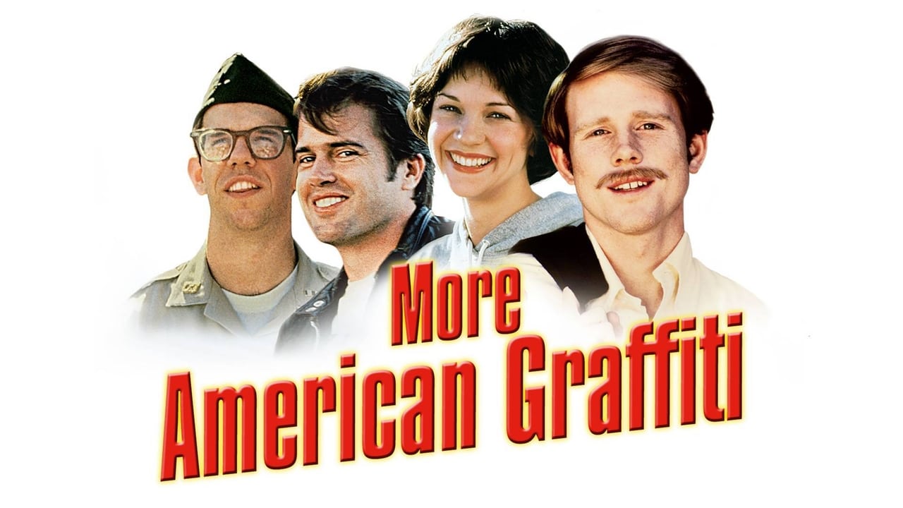
The original American Graffiti (1973) perfectly bottled the bittersweet end of an era, that last night of summer innocence in 1962. George Lucas crafted a phenomenon, a low-budget wonder ($777,000 budget becoming a $115 million smash hit – that's over $700 million today!) that resonated deeply. So, how do you follow that? Writer-director Bill L. Norton (who later gave us the cult classic Cisco Pike) didn't opt for a simple re-tread. Instead, "More American Graffiti" takes a daring leap, splintering its narrative across four consecutive New Year's Eves, from 1964 to 1967, checking in on our familiar faces: Debbie Dunham (Candy Clark, radiating the same free spirit), Terry "The Toad" Fields (Charles Martin Smith, facing a starkly different reality), John Milner (Paul Le Mat, still king of the strip, for a time), and Steve and Laurie Bolander (Ron Howard and Cindy Williams, navigating domestic life and anti-war protests).
### Four Stories, Four Screens
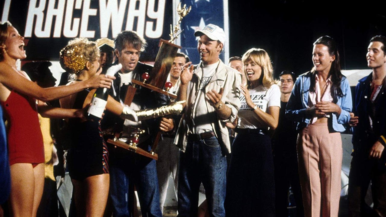
What truly sets this film apart – and likely divided audiences back then – is its ambitious visual approach. Norton decided to give each character's storyline its own distinct cinematic style and aspect ratio, often presented simultaneously via split-screen. Terry's harrowing experiences in Vietnam are shot in gritty, handheld 16mm, mimicking newsreel footage. John Milner's drag racing world gets a widescreen, polished 35mm look. Debbie's San Francisco adventures embrace a more psychedelic, free-form visual language, while Steve and Laurie's campus life drama unfolds in a standard 1.85:1 ratio. It was a bold, experimental choice, aiming to reflect the fragmentation and turmoil of the mid-60s. Did it work? Well, that’s the million-dollar question, isn't it? Sometimes it feels innovative, other times just plain confusing, making it hard to fully immerse yourself in any single thread. You have to admire the gutsy swing, though, even if it didn't quite connect with the fences. Universal reportedly wasn't thrilled with the complex visual style, fearing it would alienate viewers, a concern that proved somewhat prescient given its modest $15 million box office return.
### Growing Pains and Goodbyes
While it was great seeing Candy Clark, Bo Hopkins (reprising his role as Joe Young of The Pharaohs), Ron Howard, and the others slip back into these roles, the film carries a heavier heart than its predecessor. The carefree cruising is replaced by the harsh realities of war, protest, and the complexities of adult life. Terry's Vietnam storyline, in particular, injects a jarring dose of realism that feels worlds away from the sock hops and rock 'n' roll of the original. It reflects the changing American landscape, sure, but it fundamentally alters the nostalgic comfort food vibe many were likely expecting. It’s interesting to note that Harrison Ford makes a fleeting, uncredited cameo as Bob Falfa, pulled over on his motorcycle, but the absence of Richard Dreyfuss's Curt Henderson is keenly felt, leaving a noticeable gap in the ensemble. The film bravely tries to show these characters growing up and facing a world losing its innocence, mirroring the shift in the nation itself.
### Retro Fun Facts
Digging through the archives (or maybe just the dusty corners of memory), it's fascinating that George Lucas served as executive producer but gave Norton significant creative freedom. The multi-format approach wasn't just aesthetic; it was deeply tied to the narrative themes – the chaos of war, the sleekness of racing, the haze of hippiedom, the normalcy of campus life. It’s a textbook example of form attempting to follow function, even if the execution sometimes cluttered the screen. Apparently, test audiences found the initial cuts bewildering, leading to some re-editing to try and clarify the simultaneous timelines. The soundtrack, too, tried to recapture the magic, blending period hits, though perhaps without the seamless perfection of the original's wall-to-wall radio feel.
### A Curious Time Capsule
So, where does "More American Graffiti" land in the hallowed halls of VHS Heaven? It's not the universally beloved classic its older sibling is. It lacks the focused narrative and effortless charm. Yet, dismissing it entirely feels unfair. It's an ambitious, if flawed, experiment. It dared to be different, to tackle darker themes, and to play with cinematic form in a way few mainstream sequels ever attempt. Seeing the characters again, even amidst the fractured storytelling and tonal shifts, offers a certain bittersweet satisfaction. It’s like finding an old photo album where some pictures are faded or torn – the memories are still there, just viewed through a different, perhaps more complicated, lens.

Rating: 5/10
Justification: The 5 reflects the film's undeniable ambition and visual experimentation, plus the welcome return of familiar characters. However, it's docked points for the often confusing multi-narrative structure, the jarring tonal shifts that don't always blend, and its ultimate failure to recapture the magic or cultural impact of the original. It’s a fascinating curio, but not quite a satisfying sequel.
Final Thought: "More American Graffiti" might be the odd duckling sequel you skipped over at the rental store, but it remains a strangely compelling artifact – a bold, sometimes bewildering, snapshot of beloved characters navigating a rapidly changing world, presented with a formal daring that still feels unique today. Worth a look, if only to see what might have been.